
Graphic design is an art form that transcends mere aesthetics, serving as a powerful medium for communication and connection.
Understanding the essential principles behind effective design can elevate your work, making it not only visually appealing but also impactful and memorable.
By mastering these foundational elements, you can ensure your designs resonate deeply with your audience, turning ideas into stunning visual narratives.
Understand the Core Principles of Graphic Design
Graphic design is more than just making things look pretty; it's about communicating messages effectively through visual elements. Whether you're working on a website, a logo or a social media post, understanding the core principles of graphic design is essential. These principles guide your design decisions and help ensure that your work resonates with your audience. They are the foundation upon which all great designs are built. Mastering these elements not only makes your designs visually appealing but also improves their functionality.
The beauty of graphic design lies in how you skillfully manage elements like balance, alignment, contrast and color. When you get these principles right, your designs will not only grab attention but also communicate the intended message effectively. Let’s explore some of these essential principles and discover how they can enhance your design skills.
Balance Your Visual Elements for a Cohesive Look
When you're working on your design, it's essential to find a good balance among your visual elements. This creates a more pleasing and unified appearance. Think about how each component interacts with the others, ensuring they complement rather than clash. A well-balanced layout can draw the viewer's eye and make your message stand out effectively.
Balance in design is all about how you distribute visual weight. Imagine a seesaw; if one side is heavier, it tips over. In graphic design, you can create balance in two main ways: symmetrical and asymmetrical. Symmetrical balance gives off a feeling of formality and order, with elements evenly arranged around a central axis. In contrast, asymmetrical balance brings energy and intrigue by positioning different elements in a way that feels visually stable, even though they don’t mirror each other.
Having balanced elements makes your design feel stable and harmonious, guiding viewers through the content effortlessly. It helps prevent clutter and confusion, allowing your audience to engage with your message clearly and effectively.
Apply Alignment to Create Order and Structure
Alignment is like the glue that holds your design together. When you align elements, be it text, images, or shapes, you create a structure that helps the viewer navigate your design more easily. There are many ways to align elements: you can center them, align them to the left or right, or even create an asymmetrical layout that adds flair.
The key is to use alignment to guide the viewer’s eye and establish a clear flow. For instance, if you’re designing a flyer, aligning titles and body text in a consistent manner will make it easier for readers to digest the information. Digital tools like Figma or Adobe Express have features that help you snap elements into place, making alignment a breeze.
Use Contrast to Emphasize Important Details
Contrast is your best ally when it comes to making certain elements stand out in your design. By creating clear differences in colors, sizes or textures, you can highlight important information. Think about a bright yellow button on a dark blue background; it really grabs your attention, doesn’t it? That’s the magic of contrast at work.
Using contrast effectively not only adds visual appeal but also improves readability. It allows your audience to quickly identify the important elements in your design. Experiment with different color and size combinations to discover what makes the strongest impression. Just keep in mind that too much contrast can be overwhelming, so striking the right balance is essential.
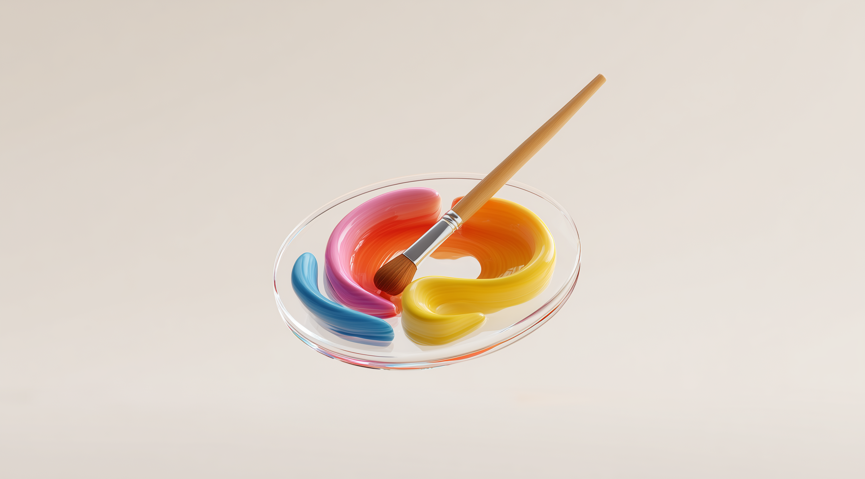
Leverage Color to Evoke Emotion and Brand Identity
Color is one of the most powerful tools in a designer's toolkit. It doesn’t just add visual appeal; it can evoke emotions, convey messages and even reinforce brand identity. For instance, blue often evokes feelings of calmness and trust, while red can create a sense of urgency.
When choosing colors for your design, consider how well they work together. Understanding color theory can help you find combinations that feel cohesive and harmonious. It's also essential to reflect your brand's personality in your color choices. The colors you pick should represent your brand’s values and resonate with your audience. A carefully selected color palette can create a strong impact and improve the overall effectiveness of your designs.
Master Practical Design Techniques for Effective Layouts
When it comes to graphic design, mastering practical techniques is essential for creating layouts that not only look attractive but also serve a purpose. It goes beyond simply arranging elements on a page; it’s about guiding the viewer through your work in a way that feels smooth and intuitive. By using these techniques, you can ensure your designs are both effective and engaging, helping your audience connect with your message.
Create Visual Hierarchy to Guide the Viewer’s Eye
Visual hierarchy is all about prioritizing information so that your audience can easily digest what you are trying to communicate. Think of it as a roadmap for the eyes. You want to lead viewers through your design by making the most important elements stand out. This can be achieved by manipulating size, color and placement. For example, a large, bold headline at the top of your design naturally draws attention first, while smaller text can follow below to provide additional details. By thoughtfully arranging these elements, you create a seamless flow that makes it easier for viewers to take in the information without feeling overwhelmed.
Use White Space to Enhance Clarity and Focus
White space or negative space, is often overlooked but should never be underestimated. It’s the area around and between design elements that allows for breathing room. Incorporating white space effectively can enhance clarity and focus in your design. Instead of crowding every inch of your layout with visuals or text, leave some areas open. This not only helps to reduce clutter but also directs attention to the focal points of your design. When you give your elements space to breathe, you make it easier for viewers to understand and appreciate the content you’ve created.
Apply Proximity to Group Related Elements
Proximity is a powerful technique that involves placing related elements close together to show their relationship. It’s a simple but effective way to organize information and improve comprehension. For instance, if you’re designing a flyer, you might group the title, image and key details together. By keeping related items close, you’re signaling to viewers that they belong together. This helps to create a logical structure that guides them through the information without confusion. When things are organized well, it not only enhances the overall aesthetic but also makes your design more functional.
Repeat Design Elements to Build Cohesion and Brand Recognition
Repetition is a design technique that focuses on reusing certain elements throughout your project to create unity and consistency. This could mean using the same color palette, typeface or graphic styles across different sections of your design. By repeating these elements, you help to establish a cohesive look that reinforces your brand identity. It’s like a signature style that makes your work recognizable. For example, if you use a specific shade of blue in your logo, carrying that color throughout your website or marketing materials strengthens the visual connection and helps your audience remember your brand. Repetition builds familiarity, which is a powerful tool in graphic design.
Integrating these practical techniques into your design process can significantly improve the effectiveness of your layouts. Each technique complements the others, leading to a more refined and professional final product. The next time you sit down to create, keep these principles in mind and watch your designs truly come to life!
Take Deliberate Actions to Refine Your Graphic Designs
In graphic design, being mindful of your choices can significantly impact your work. Every element you incorporate should have a clear purpose. This involves carefully considering your decisions, whether it's the colors you select, the fonts you opt for or even the spacing between different components. A design that feels unified and intentional tends to connect better with viewers and communicates your message more powerfully. Let’s explore some key areas where you can enhance your designs through thoughtful actions.
Ensure Every Design Choice is Intentional
Every detail in your design should be a conscious decision. Think of it as telling a story; each element contributes to the narrative you're trying to convey. Whether you’re deciding on a color, a shape or a layout, ask yourself: what purpose does this serve? If something feels off or unnecessary, it’s okay to remove it. Embracing simplicity can often lead to a more powerful visual communication. The idea is to create a design that feels unified, where each component complements the others, rather than distracts.
Keep Color Palettes Simple and Avoid Clashing Colors
Color has the power to stir emotions and set the mood for your design, making it important to choose your palette thoughtfully. Focus on a few key colors ideally two or three that complement each other and convey the message or brand identity you want to express. It’s best not to overdo it; using too many colors can create a confusing visual experience. Be mindful of how colors interact; clashing hues can create a jarring effect that distracts viewers from your core message. Instead, aim for a blend that feels inviting and cohesive.
Utilize Readable Fonts and Limit Typeface Variety
The fonts you choose have a big impact on how your message is perceived. It's best to stick with typefaces that are easy to read, especially for the main text. Classic options like Helvetica or Arial are great choices since they’re both neutral and clear. For headlines and other design elements, you can have a bit more fun, but try to limit yourself to two or three different fonts throughout your layout. This approach keeps everything looking tidy and minimizes any visual clutter. The key is to ensure your message is communicated effectively.
Follow Consistent Measurement and Spacing Rules
Consistency is key in graphic design and that extends to measurements and spacing. Using a grid system or a mathematical scale can help ensure that your layouts feel balanced and harmonious. For instance, spacing between elements should be intentional, think about how much room you want between text blocks or images. This not only enhances readability but also guides the viewer's eye through your design. Keeping everything aligned and uniformly spaced can make your design look polished and professional, which is something every designer should strive for.
By taking these deliberate actions, you’ll find that your designs become more refined and impactful. It's all about being mindful of how each choice can elevate the overall experience for your audience.
Explore Advanced Concepts and Future Trends in Design
In the dynamic field of graphic design, grasping the basic principles is just the starting point. As a designer, it's important to stay aware of more advanced ideas and the latest trends that can take your work to the next level. This isn't merely about sticking to the rules; it's about understanding when and how to bend or break them in a way that strengthens your message and connects with your audience. As you develop your skills, you’ll discover that creativity often flourishes when you move beyond traditional design boundaries.
Innovation is key in design and staying ahead of the curve requires a willingness to experiment. This means not only honing your technical skills but also cultivating a unique perspective that allows you to reinterpret traditional principles. As you explore new styles and techniques, you’ll discover that the most compelling designs often come from a blend of structured knowledge and spontaneous creativity.
Develop Your Own Eye for Breaking Rules Creatively
Learning when to break the rules can be one of the most liberating aspects of being a designer. It might sound counterintuitive, but some of the most memorable designs come from those moments of creative rebellion. Think of it as a dance between structure and spontaneity. For instance, you might choose to play with asymmetrical balance to create a more dynamic layout or use unexpected color combinations that evoke strong emotions.
The key is to ensure that your creative decisions align with your design's goals and the message you want to convey. When you break the rules, do it with intention. Ask yourself what you hope to achieve. Are you trying to grab attention? Create a sense of movement? By having a clear purpose behind your choices, you’ll be able to push boundaries while still creating compelling and effective designs.
Stay Inspired by Constantly Learning and Observing Design Around You
Inspiration is all around us and as a designer, it’s important to stay aware of what’s happening in the world. Try to make a habit of observing your surroundings this could be anything from art and architecture to nature or even how people interact with products and brands. The more you immerse yourself in different styles and ideas, the richer your design vocabulary will become.
Continuing to learn is equally important. Consider diving into design blogs, participating in workshops or joining design communities. Connecting with fellow creators can spark new ideas and help you stay updated on the latest trends. Design isn’t just about the final product; it’s a journey filled with exploration and growth. By feeding your curiosity and embracing new learning opportunities, you’ll not only enhance your skills but also keep your creative spirit alive.
Conclusion
To sum it all up, understanding the key graphic design principles we've discussed is vital for any designer who wants to produce work that is engaging and visually striking.
By understanding core principles such as balance, alignment, contrast and color, you can enhance both the aesthetics and functionality of your designs.
Using practical techniques such as visual hierarchy, white space and thoughtful design choices can really enhance your layouts and boost viewer engagement.
As you continue to develop your skills, remember that creativity often thrives when you embrace innovation and learn to break the rules thoughtfully.
By staying observant and continuously learning, you will not only elevate your design capabilities but also keep your creative passion alive.