
Graphic design is more than just aesthetics; it’s a powerful tool that shapes how we communicate and connect with the world around us.
Understanding essential design principles can transform your creative projects, making them not only visually appealing but also effective in conveying your message.
By mastering these foundational concepts, you’ll elevate your designs and engage your audience like never before.
Understand the Core Design Principles in Graphic Design
Graphic design serves as a powerful visual language that conveys a lot without words. Whether you're designing a logo, a website or a marketing brochure, grasping the essential design principles can greatly improve your work. These principles provide a solid foundation that not only enhances the visual appeal of your designs but also ensures your message is communicated clearly. Let's explore some important principles that every designer should consider when creating their works of art.
Focus on Alignment for Clear Visual Structure
Alignment is more than just making things look neat; it’s about creating a visual structure that makes sense. When elements are aligned, they form a cohesive unit that guides the viewer’s eye naturally across the design. Think of it as the invisible lines that connect your visuals, helping to create a sharp and organized appearance. Whether you choose a center, left or right alignment or even an asymmetrical layout, the goal is to ensure that everything feels connected. This not only enhances readability but also helps the viewer navigate through your design with ease.
Apply Contrast to Highlight Key Elements
Contrast is an essential element in graphic design. It focuses on highlighting certain features by creating noticeable differences. By experimenting with color, size, texture or shapes, you can direct attention to the key aspects of your design. For instance, a striking headline in a vibrant hue set against a subdued background immediately draws the eye. This approach not only makes your design more visually appealing but also emphasizes important information, helping your audience understand your message more quickly.
Create Balance to Distribute Visual Weight Effectively
Balance in design is like achieving a sense of equilibrium. It involves distributing visual weight so that no part of your design feels off-kilter or overcrowded. You can create balance symmetrically, with elements evenly arranged on both sides or asymmetrically, where different weights work together to form a more engaging composition. This balance enhances your design, guiding the viewer’s eye and making the overall experience more enjoyable. Think of it like a seesaw; when both sides are even, it functions beautifully.
Establish Hierarchy to Guide Viewer Attention
Hierarchy plays an important role in guiding viewer attention in a logical manner. By organizing elements based on their significance, you can effortlessly steer your audience through your design. This can be achieved through variations in size, contrasting colors or thoughtful placement. For example, a large, bold title at the top of a page naturally draws attention first, followed by smaller subheadings and body text. Creating this order helps viewers grasp the structure and flow of your content, making it easier to understand.
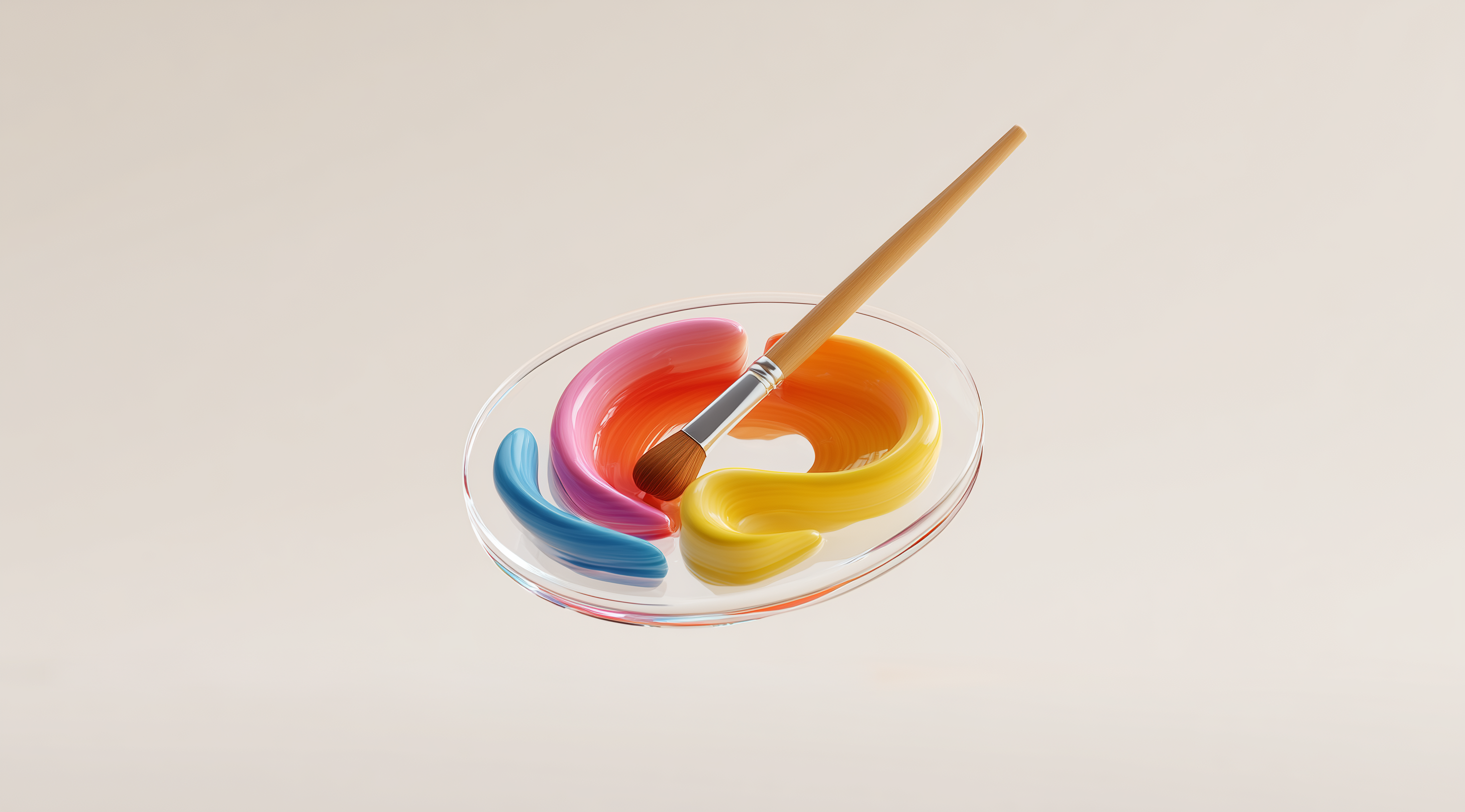
Use Color to Evoke Emotions and Reinforce Messages
Color goes beyond just looking good; it’s closely linked to our feelings and how we communicate. Different hues can stir up a range of emotions. Blues can bring a sense of calm, reds can spark excitement, and yellows can create a feeling of warmth. By grasping the basics of color theory, you can select color schemes that not only align with your brand but also connect with your audience on an emotional level. Keeping your color choices consistent throughout your designs helps reinforce your message and builds a stronger brand identity, making it more memorable.
Incorporate White Space to Improve Readability and Emphasis
White space, often referred to as negative space, is a designer's best friend. It’s the area around and between different elements that helps to minimize clutter and enhance readability. By adding some breathing room in your design, each element stands out and captures attention more effectively. This minimalist approach can give your work a more polished look, allowing viewers to focus on the key messages. Embracing white space can really elevate your design, creating a feeling of calm and clarity.
Grasping these fundamental principles can really change how you approach graphic design. They act as a guiding framework for your creative choices, helping you create designs that not only look appealing but also fulfill a purpose. Whether you’re an experienced designer or new to the field, keeping these principles in your toolkit can lead to designs that are more impactful and engaging.
Master Practical Techniques to Apply Graphic Design Principles
When diving into graphic design, understanding how to practically apply the core principles can make all the difference in your projects. It's not just about knowing them in theory; it's about weaving these principles seamlessly into your design process. By mastering these techniques, you can create designs that are not only visually appealing but also effective in communicating your intended message.
Leverage Proximity to Organize Related Elements
Proximity is all about the closeness of elements in your design. When you group related items together, you help viewers make connections and understand the relationships between different pieces of information. Think of it this way: if you have a title and a paragraph of text that explains it, placing them close together creates a natural bond in the viewer's mind. This technique helps to declutter your design and improve readability. It’s a simple yet powerful way to guide the viewer’s understanding without overwhelming them with too much space or too many distractions.
Use Repetition to Create Consistency and Unity
Repetition is a fantastic tool for establishing consistency across your designs. By using the same colors, fonts or shapes throughout your work, you create a sense of unity that can strengthen your brand identity. Imagine walking into a store where everything looks mismatched; it can be confusing, right? On the flip side, when elements repeat in a thoughtful way, it not only looks more professional but also reinforces the message you're trying to convey. This doesn’t mean everything has to be identical; rather, think of it as creating a rhythm in your design that resonates with the viewer.
Apply Rhythm to Guide Visual Flow and Interest
Rhythm in design is similar to rhythm in music. It’s about creating a flow that guides the viewer's eye through your work. You can achieve this by repeating elements at regular intervals, which helps establish a pattern that feels comfortable and engaging. Whether it’s alternating colors in a layout or spacing out images, rhythm can keep the viewer’s attention and create a sense of movement. It’s a way to make your designs feel dynamic and alive, inviting viewers to explore each section rather than losing interest halfway through.
Consider Movement to Lead the Viewer’s Eye Through the Design
Movement involves strategically placing elements to guide the viewer's eye in a particular direction. This can be achieved through lines, shapes or even the arrangement of text. For instance, if you have a hero image on your webpage, you might want to position call-to-action buttons in a way that naturally leads from the image to the text. By creating a path for the viewer to follow, you ensure that they don’t miss out on important information. It’s like telling a story through your design, where every element plays a role in the narrative.
Create Emphasis to Highlight the Most Important Information
Emphasis plays a key role in making sure your audience notices the most important parts of your design. You can use techniques like contrast, size and placement to highlight essential elements. For instance, if you want a specific message to grab attention, you might opt for a bold font or a bright color that stands out against the rest of your design. This helps create a focal point that naturally draws the viewer's eye. Keep in mind that you can't emphasize everything; it's about making thoughtful choices that showcase the most vital information while still keeping a unified appearance.
Ensure Unity to Make All Elements Work Harmoniously
Unity brings everything together, making sure that all the elements in your design feel connected. This can be achieved by using a consistent color scheme, similar font choices or shapes that complement each other. When your design components blend well, they create a more enjoyable experience for viewers. It's like crafting a well-coordinated piece of music where every instrument plays its part without stepping on each other's toes. Striving for unity doesn’t mean you have to sacrifice creativity; rather, it helps you convey your ideas clearly and professionally.
By learning these practical techniques, you can take your graphic design work to a whole new level. Each principle acts as a building block and when you apply them thoughtfully, they can turn your designs from average to exceptional. Whether you're creating a simple flyer or working on a detailed branding project, these ideas will help you craft visuals that truly connect with your audience.
Explore Advanced Concepts and Evolving Graphic Design Principles
Graphic design is a dynamic field that's constantly shaped by new trends, technologies and the changing needs of users. As designers, it's important to understand the basic principles while also exploring more advanced concepts that can elevate our work. This journey often involves questioning conventional ideas and experimenting with fresh approaches in design. Let’s take a look at some exciting areas where you can enhance your graphic design skills.
Experiment with Breaking Traditional Design Rules Intentionally
One of the most exciting things about graphic design is the ability to intentionally break the rules. While foundational principles like balance, contrast and alignment offer a strong foundation, true creativity often emerges when we venture beyond those limits. Just look at the iconic designers who have made a name for themselves by embracing asymmetry, vibrant colors or unexpected layouts. Take, for example, unconventional typography that might challenge readability but still grabs the audience’s attention. This kind of experimentation can spark innovative ideas and lead to distinctive designs that really stand out in a crowded market. The important thing is to have a solid understanding of the rules so you can decide when and how to bend them.
Incorporate Texture and Pattern to Add Depth and Interest
When it comes to creating visually engaging designs, texture and pattern are essential. They can elevate a flat design into something that feels vibrant and lively. Picture a background that resembles natural materials or a subtle design that enhances the overall look without distracting from the main content. Texture can stir emotions and establish a mood, making your design not just something people look at, but something they can truly feel. Patterns can tie different elements together or establish a flow that guides the viewer’s eye across the composition. Consider how a thoughtfully placed texture or pattern can enrich the storytelling in your designs, making them not only more attractive but also more memorable.
Adapt Principles for Accessibility and Inclusive Design
As we continue on our design journey, it’s important to think about how inclusive our work is. Accessibility goes beyond just being a legal obligation; it’s about creating designs that everyone can engage with. This means we need to adjust our design principles to meet different needs. For instance, using high-contrast colors can help those with visual impairments, while clear typography is beneficial for users who struggle with reading. Including alternative text for images also makes a big difference, as it allows screen readers to share information with visually impaired users. By making intentional design choices, we can create a more inclusive environment that invites all users and enhances their overall experience.
Bringing these advanced concepts into your design practice not only showcases your growth as a designer but also enhances the experience for your audience. Graphic design is constantly evolving, so stay curious and keep exploring the limits of what you can achieve!
Conclusion
Grasping and using the fundamental principles of graphic design are vital for any designer who wants to produce work that is both effective and visually striking.
From alignment and contrast to hierarchy and unity, these foundational concepts serve as a guide for crafting designs that clearly communicate messages while engaging the audience.
As the field of graphic design continues to evolve, embracing advanced techniques and considerations, such as accessibility and intentional experimentation, can further enhance your creative practice.
By constantly honing your skills and keeping an eye on new trends, you can enhance your designs and create a real difference in visual communication.