
In a world saturated with visuals, the ability to create depth in graphic design is what sets captivating works apart from the ordinary.
Depth not only enhances the aesthetic appeal of a design but also fosters a more engaging experience for viewers, drawing them into a narrative that feels both immersive and relatable.
Understanding and applying the principles of depth can transform your designs, making them not just seen, but felt.
Understand what depth means in graphic design
Depth in graphic design isn't just about making things look nice. It's about creating a sense of space within a two-dimensional medium. Imagine looking at a flat image and feeling like you can reach into it or walk around it. That's the magic of depth! It gives designs a three-dimensional quality that draws the viewer in, making the artwork feel more alive and engaging.
When we talk about depth, we often refer to the perceived distance and dimensionality of elements within a design. This can be achieved through various visual techniques that trick our brains into thinking there's more to the image than what meets the eye. Depth can transform a simple, flat design into something dynamic and captivating, enhancing the overall message and aesthetic appeal.
Grasping the concept of depth means understanding how various elements can interact to create layers and levels. It’s about recognizing how size, placement, and visual cues work together to direct the viewer's attention and stir emotions. When you think about depth, view it as a vital tool in your design toolkit. A means to make your work not just visible, but impactful. Whether you’re designing a logo, a poster or a website, incorporating depth can significantly enhance audience engagement and effectively communicate your message.
Recognize why depth matters in your designs
Depth in graphic design is about more than just aesthetics; it significantly influences how viewers engage with your work. Think of it like walking through a forest. The layers of trees, with some appearing near and others fading into the distance, create a sense of space and realism. This is what depth achieves in design. It reflects real-life experiences, guiding the viewer's eye and crafting a more captivating visual story.
In a world where capturing attention is increasingly challenging, engaging your audience effectively is key. Adding depth to your designs can entice viewers, encouraging them to spend a bit more time with your work. This strategy brings visual interest, moving away from the flat, minimalist styles that have been popular in recent years. By introducing a sense of dimensionality, your designs can feel vibrant and even develop their own unique personality. This added layer of engagement can make all the difference between a design that gets ignored and one that genuinely connects with its audience.
Depth is essential for organizing information in your design. It creates a hierarchy that guides the viewer's attention to the most important parts. When you layer elements thoughtfully, it becomes obvious where the viewer should look first. This clarity is particularly important in web design, where users often scan content rather than read it all. By incorporating depth, you enhance usability, making it easier for your audience to navigate through the information. Depth not only boosts the visual appeal of your designs but also reinforces the message you want to convey. It's about crafting an experience that feels more three-dimensional, encouraging interaction and connection.
Apply techniques to create depth in graphic design
Creating depth in graphic design is all about adding that extra layer of visual interest, making your designs feel more dynamic and engaging. When you incorporate depth, it not only makes your work more aesthetically pleasing but also helps convey information more effectively. Here are several techniques you can use to bring depth into your designs.
Use overlapping elements for layered effects
One of the simplest ways to create depth is by overlapping elements. By placing one graphic in front of another, you give the viewer a sense of layering that mimics real life. Think about how objects in the physical world interact when one item is in front of another, it creates a visual hierarchy. This technique can guide the viewer's eye and help emphasize the most important elements in your design. For instance, if you have a text box over a colorful background, letting some of the design peek through creates that nice layered look, making it feel more three-dimensional.
Manipulate size and scale to show distance
Size and scale are powerful tools in graphic design. When you play with the size of your elements, you can create a perception of depth. Larger elements appear closer to the viewer, while smaller ones seem to recede into the background. This is much like how we perceive objects in real life; think about a road leading into the horizon where objects get smaller as they move away from you. By strategically varying the sizes of your graphics, you can give a sense of depth and dimensionality to your design.
Add shading and shadows to enhance dimensionality
Shading and shadows are classic techniques for adding depth. By applying subtle drop shadows, you can create the illusion of elevation, making elements look like they're resting above the background. This not only adds dimension but also enhances usability, as buttons and interactive elements become more obvious. Just a gentle touch of shadow can lift a design, giving it a more polished look while keeping with a flat aesthetic.
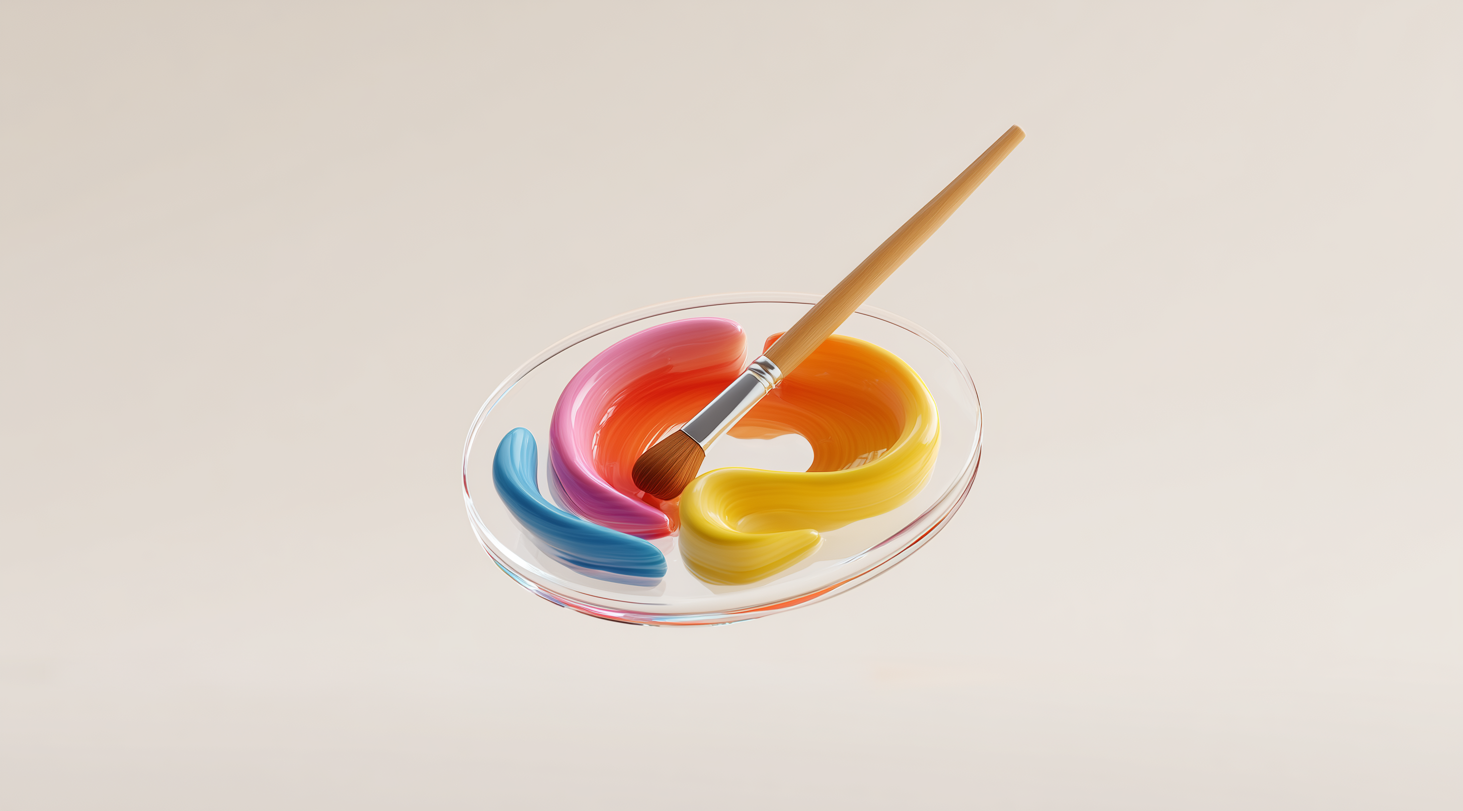
Create depth using color and value contrast
Color is essential for creating depth in a design. Warm colors usually stand out, while cooler tones tend to fade into the background. By using contrasting colors and different shades, you can establish a visual hierarchy. For example, a bright red button on a blue background will really stand out and grab attention. This interplay of colors can direct the viewer’s gaze and add more depth to the overall composition.
Incorporate perspective to simulate distance
Perspective is a key element in simulating depth. Linear perspective, which involves using converging lines towards a vanishing point, can create an almost cinematic quality in your designs. This technique helps to establish a spatial relationship between elements, giving the viewer's eye a path to follow. Whether you’re designing a website or a poster, using perspective can create a more immersive experience.
Explore depth of field with focus and blur
Playing with depth of field adds another layer of sophistication to your designs. By using focus and blur, you can direct attention where you want it. Imagine a photograph where the foreground is sharp, while the background is slightly blurred; this effect creates a sense of depth and draws the viewer’s eye to the subject. You can apply similar principles in graphic design by blurring non-essential elements to create a clear focal point.
Use layering with transparent objects
Layering transparent objects can create fascinating visual effects. When you overlap transparent elements, you can achieve new colors and textures, enriching the overall depth of the design. This technique adds complexity and intrigue, allowing elements to interact in a way that mimics the real world. Think about how glass or translucent materials behave; using this concept can elevate your designs.
Add texture to imply depth and realism
Texture is another effective way to convey depth. By introducing different textures, you can imply dimensionality that engages the viewer's sense of touch. Whether it’s a rough, gritty surface or a smooth, sleek finish, textures can help distinguish elements and create a more immersive experience. Consider how tactile qualities can translate visually; the right texture can make your design feel more alive.
Apply gradients in backgrounds for depth illusion
Gradients can really enhance the sense of depth in your designs. When used thoughtfully in the background, they allow for a smooth transition of colors that prevents a flat appearance and adds dimension. Picture a sunset where the colors blend effortlessly; that’s the kind of vibe you want to capture. Just be mindful not to overdo it too many gradients can create a cluttered look, so it’s important to strike a balance.
By using these techniques, you can really enhance the depth of your graphic designs, making them more engaging and visually striking. Each method brings something unique that helps your work stand out and creates a richer experience for the viewer. The next time you sit down to design, remember these tools to bring your creations to life!
Master subtle effects to enhance depth in flat design
When it comes to flat design, the challenge often lies in making it visually appealing without losing that sleek, minimalist feel. While flat design is celebrated for its simplicity, it can sometimes come off as too sterile or uninspired. To combat this, mastering subtle effects can help you create depth that adds personality and visual interest. This is all about finding the right balance; you want your designs to feel engaging and dynamic without overwhelming the viewer.
One of the most effective ways to enhance depth is through color. By using a thoughtful color palette, you can create layers that draw the eye and add dimension. For instance, colors that contrast well against each other can help separate elements, making it easier for viewers to navigate your design. Think about how some colors appear to pop out while others recede; this can guide the viewer’s focus and create a sense of hierarchy. Brands like Fitbit and Healthbook effectively utilize vibrant colors that not only enhance usability but also maintain the essence of flat design.
Use color strategically to create layers
Color is an incredibly powerful tool in graphic design. It has the ability to evoke emotions, set a mood and now, more than ever, create layers. By strategically choosing colors that contrast yet complement one another, you can add a sense of dimension to your flat designs. For example, consider using a brighter shade in the foreground while opting for a more muted version of the same hue in the background. This subtle difference can create a layered effect that feels fresh and engaging. It’s all about how you use color to guide the viewer's eye and create a visual pathway through your design.
Incorporate subtle layer effects and shadows
Layer effects in flat design can sometimes feel a bit off, but when used in moderation, they can really add a nice sense of depth. Take drop shadows, for example. Although they used to be considered a no-no in flat design, they can actually improve usability by giving elements a slight lift from the background. This makes buttons or icons feel more interactive and tangible. A great illustration of this is Google’s Gmail interface. The subtle shadows on the buttons keep that flat look while enhancing the overall user experience. Just keep in mind that the trick is to keep these effects subtle; you want to complement your design, not overpower it.
Use gradients and blending modes wisely
Gradients can be tricky, especially in flat design, where the goal is often to keep things simple. However, when applied with intention, gradients can create a beautiful illusion of depth. Using a soft gradient in the background can help create a sense of space and dimension without making the design feel cluttered. This is where blending modes come into play. They allow you to manipulate how colors interact with each other, creating darker intersections that add depth while preserving the flat design aesthetic. Websites like General Assembly utilize these techniques effectively, showcasing how a little creativity can go a long way in enhancing visual appeal.
In the end, mastering subtle effects in flat design is all about balance. By thoughtfully applying color, layer effects and gradients, you can create designs that are not only beautiful but also functional and engaging. It’s about finding that sweet spot where simplicity meets depth, inviting viewers to interact with your work.
Conclusion
Understanding depth in graphic design is essential for creating visuals that genuinely engage viewers and make a memorable impact.
By utilizing various techniques such as overlapping elements, manipulating size and scale and applying shading, designers can transform flat designs into dynamic compositions that resonate with viewers.
Depth not only enhances the aesthetic appeal but also improves usability and guides the audience's attention effectively.
As you explore these methods, remember that balance is key; subtle effects can elevate your designs without overwhelming them.
Embracing depth creates a more engaging visual experience, which helps build a stronger connection between your work and its audience.