
In a world saturated with visual content, mastering visual hierarchy is the key to capturing attention and communicating effectively.
This essential design principle helps you organize elements in a way that guides the viewer’s eye, ensuring that important information stands out and resonates.
Understanding how to create a thoughtful visual flow not only enhances aesthetic appeal but also elevates user engagement, making your designs more impactful.
Understanding Visual Hierarchy in Graphic Design
Visual hierarchy is all about organizing elements on a page in a way that makes it easy for the viewer to understand the information being presented. Think of it as a roadmap helping guide the eyes naturally from one point to another. When done correctly, visual hierarchy leads the viewer through the content, highlighting what’s most important and creating a comfortable flow. It’s a fundamental principle in graphic design that not only enhances aesthetics but also improves usability.
At its essence, visual hierarchy depends on different design elements like size, color, contrast, and spacing. Each of these factors significantly influences how we perceive information. For instance, larger elements naturally grab more attention, while contrasting colors can highlight specific areas of a design. When designers use these elements thoughtfully, they can guide viewers through the content, helping them grasp the main messages without feeling overloaded.
Key Principles That Define Visual Hierarchy
Several key principles can help create an effective visual hierarchy. First off, size and scale play a significant role; larger elements are often seen as more important. That’s why you commonly find product prices or headlines in bolder, bigger fonts; they need to catch your eye. Color also matters a great deal. Bright, vibrant hues can draw attention, while softer, muted tones tend to blend into the background, subtly guiding the viewer’s eye through the design.
Contrast is key in design. A noticeable difference between the text and its background significantly improves readability, and emphasizes important information. How items are spaced and arranged is also important for grouping related elements. When things are positioned close to one another, they are often seen as a cohesive unit, making it easier for people to understand their connections. Maintaining consistency in design like sticking to similar fonts and colors creates a sense of familiarity, helping users navigate the visuals with ease.
How Visual Hierarchy Affects User Perception and Engagement
Visual hierarchy significantly impacts how users perceive and engage with content. It’s fascinating to think about how quickly we form impressions, often within mere milliseconds. Good visual hierarchy can minimize uncertainty and make information more accessible, which in turn keeps users engaged. If a design feels cluttered or chaotic, users may feel overwhelmed and disengage.
A clear visual hierarchy makes it easier for users to navigate content instead of just relying on their memory. This is especially important in today’s rapidly changing online environment, where people often skim through information. By guiding their gaze along familiar patterns like the F or Z shapes commonly seen in Western reading, designers can help users quickly locate and understand key information. Taking the time to create a thoughtful visual hierarchy not only enhances the overall user experience but also builds trust and encourages users to dive deeper into the content.
Apply Size and Scale to Emphasize Important Elements
When it comes to graphic design, size and scale are powerful tools that can dramatically influence how viewers interact with a layout. Think of size as a way to communicate importance. Larger elements naturally draw the eye first, making them ideal for headlines, calls to action or any piece of information that you want to stand out. For instance, in an advertisement, if the price is significantly larger than the rest of the text, it immediately signals to the viewer what they should pay attention to. This technique isn’t just about making things big; it’s about using size strategically to prioritize information.
Scale adds a relative perspective to your design. It’s not simply about enlarging one element; it’s about how the sizes of different components relate to each other. For instance, when a large image is placed next to a small block of text, the image tends to grab the viewer's attention, often overshadowing the text. The key is to establish a visual relationship between elements, allowing the eye to move smoothly across the page. This approach can guide viewers through your content in a way that feels natural and intuitive.
By carefully considering size and scale, you can establish a hierarchy that not only grabs attention but also makes your design easy to digest. It’s similar to telling a visual story, where the most important elements shine, while the supporting details offer context without overshadowing the main point. Focus on what you want your audience to notice first and how the overall layout feels. Each decision about size should enhance the message you’re aiming to communicate.
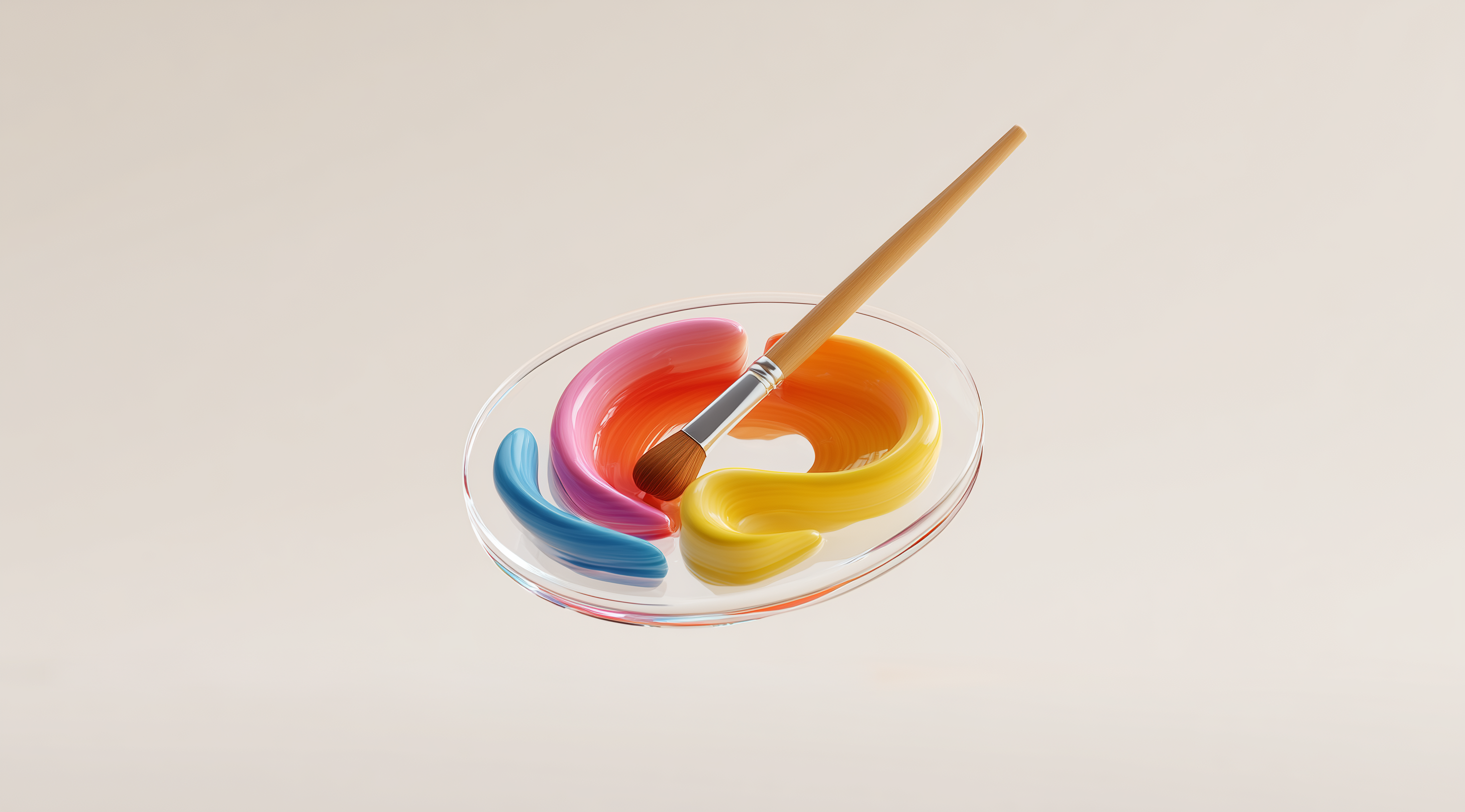
Use Color and Contrast to Guide the Viewer’s Eye
Color and contrast are powerful tools in graphic design that can significantly influence how viewers perceive information. When used effectively, they can draw attention to important elements and create a sense of hierarchy that guides the viewer's eye across the layout. Think about it: when you see vibrant colors, your attention is immediately captured. Bright reds, yellows and blues can evoke emotions and signal significance, making them ideal for calls to action or key messages.
Muted colors can create a calm and cohesive look that allows more vibrant elements to stand out. Striking this balance is important; if everything on the page demands attention, it can quickly become overwhelming and lose its intended effect. By thoughtfully using color to emphasize certain areas, you create a visual flow that guides the viewer smoothly from one point to another.
Contrast plays an essential role in making different elements stand out. For example, a strong difference between text and its background can greatly enhance readability, ensuring your message grabs attention. Think about trying to read light gray text against a white background; it’s not only frustrating but also makes it easy to overlook important details. Contrast also helps clarify relationships between elements. Similar colors can suggest a connection, while distinctly different colors indicate clear separation.
Together, color and contrast create a visual language that communicates meaning beyond the words on the page. When you think about your design choices, consider how these elements can work together to enhance understanding and engagement. The right color palette paired with thoughtful contrast can transform a good design into an amazing one, effortlessly guiding your audience's attention where you want it to go.
Leverage Typography for Organized and Clear Communication
In graphic design, typography goes beyond just choosing a nice font; it significantly impacts how information is conveyed. Effective typography brings order and clarity, guiding the viewer’s eye and making sure the message is communicated clearly. You can think of typography as the voice of your design. Just like a conversation can change with different tones and volumes, the way you present type can influence how the audience perceives and connects with your content.
Using typography effectively means paying attention to how various text elements work together. You want to create a visual hierarchy that allows the most important information to stand out. This might involve varying the sizes of your headings, subheadings and body text to create a clear pathway for the reader. The right choice of typography can make your design feel cohesive and intentional, making it easier for users to navigate through the content.
Establish Typographic Hierarchy with Font Size and Weight
Creating a typographic hierarchy starts with understanding font size and weight. For instance, your main headings should be significantly larger than the body text, instantly signaling to the viewer what is most important. This difference in size helps guide the reader’s attention to key points without them even realizing it. Weight plays a vital role too; using bolder fonts for headings or important messages can help them stand out even more. Think of it as the difference between shouting and whispering in a conversation, bold fonts grab attention, while lighter weights can keep the focus on less critical information.
It’s important to think about how different combinations of font sizes and weights can create a sense of rhythm in your design. This rhythm not only improves readability but also adds a visual flow that keeps the viewer interested. When executed well, your typography can guide the viewer's eye smoothly from one part of the design to another, making their experience more enjoyable and intuitive.
Choose Typeface Styles That Enhance Readability and Mood
Choosing the right typeface goes hand in hand with establishing hierarchy. You want typefaces that not only look good together but also enhance the readability of your content. Sans-serif fonts often convey a modern and clean feel, while serif fonts can add a touch of tradition and formality. Depending on the mood you wish to project, your choice of typeface can significantly impact how your message is perceived.
For instance, when designing a children's book, using playful, rounded fonts can really bring out a sense of fun and whimsy. In contrast, if you’re creating a corporate report, a more straightforward and professional font will probably resonate better with your audience. The important thing is to make sure your typeface matches the overall tone of your design and effectively conveys the message you want to share. By carefully choosing fonts that boost readability and set the right mood, you can take your design from simply functional to genuinely engaging.
Optimize Spacing and Proximity for Visual Grouping
When it comes to graphic design, spacing and proximity are fundamental elements that can dramatically influence how viewers interpret and interact with your work. Think about how we naturally perceive objects in our environment; we tend to group things that are close together and see them as related. This instinctive behavior can be harnessed in design to create clear visual relationships and enhance user experience.
By adjusting the spacing between elements, you can create visual groupings that help guide the viewer's eye. For instance, when two images or blocks of text are set close together, they communicate a connection. Conversely, if you space them further apart, you signal that they are separate entities. This principle not only aids in organizing content but also enhances clarity, making it easier for users to navigate through information without feeling overwhelmed.
Effective use of proximity can also reduce cognitive load. By clustering related items, you help users digest information more easily. Imagine a web page where product options are neatly grouped together; the user can quickly identify what’s relevant without having to sift through unrelated content. This grouping fosters an intuitive understanding of relationships and importance, allowing users to focus on what matters most.
Optimizing spacing and proximity goes beyond just looking good; it’s essential for improving communication and usability. When elements are arranged with care, they form a cohesive visual story that captivates the viewer and keeps their attention. Whether you’re working on a website, a poster or a branding package, it’s important to consider how spacing and proximity can enhance your visual hierarchy.
Implement Alignment and Repetition for Consistency
When it comes to graphic design, alignment and repetition are two fundamental principles that can significantly enhance the overall coherence of your layouts. Think of alignment as the invisible threads that connect elements on a page. When items are well-aligned, they create a sense of order, making it easier for viewers to navigate the design. For instance, aligning text and images in a consistent manner helps guide the viewer’s eye and establishes expectations about where to find information. If everything is haphazardly placed, it can lead to confusion and frustration. By keeping elements aligned, you allow the viewer to focus on the content rather than getting distracted by the layout itself.
Repetition goes hand in hand with alignment. It’s all about creating a sense of unity and familiarity within your design. By repeating specific visual elements, like colors, shapes or fonts, you reinforce relationships between different parts of the design. This doesn’t mean everything has to look the same, but using consistent styles helps the audience recognize and understand the connections between various sections. For example, if you use a particular color for headings throughout your design, it signals to viewers that these headings are part of the same hierarchy, enhancing their ability to scan and comprehend the content.
When you combine alignment and repetition, you create a rhythm in your design that is not only visually appealing but also functional. This combination gives your layout a sense of purpose and thoughtfulness, which can greatly enhance user engagement with your work. Next time you’re designing, take a moment to consider how these two principles can work together to provide a more organized and consistent experience for your audience.
Create Clear Focal Points Using Composition Techniques
In graphic design, creating clear focal points is essential for guiding viewers' attention and effectively communicating your message. Composition techniques are key in establishing these focal points, as they help organize elements in a way that naturally draws the eye where you want it to go. By carefully arranging visual components, you can steer viewer engagement and improve their overall experience.
One of the best ways to enhance your design is by using the Rule of Thirds, a timeless principle in visual arts. Picture dividing your layout into a grid with two horizontal and two vertical lines, resulting in nine equal sections. According to this guideline, you should place the most significant elements along these lines or at their intersections. This off-center arrangement often leads to more engaging and visually interesting layouts. By positioning a focal point in these key areas, you not only draw the viewer's attention but also create a pleasing sense of balance in your design.
Another powerful technique is the Rule of Odds. This principle suggests that using an odd number of elements in your composition can be more visually appealing than an even number. The idea is that odd-numbered groups create a natural sense of focus and lead the viewer’s attention more effectively. For instance, if you're designing a promotional graphic, think about using three products instead of two. This subtle shift can make a big difference in how the information is perceived, drawing viewers in and encouraging them to explore the design further.
Use the Rule of Thirds and Rule of Odds to Enhance Focus
The Rule of Thirds and the Rule of Odds work beautifully together to enhance the focus and interest of your design. When you apply these principles, you're not just arranging elements randomly; you're creating a visual narrative that speaks to the viewer. Placing a key image or piece of text at one of the intersections of the Rule of Thirds grid naturally draws attention. If you then pair this with an odd number of related elements, such as three supporting images or text blocks, you create a cohesive story that feels inviting and accessible.
This combination helps to break the monotony that can often come with symmetrical layouts. Instead of everything being perfectly balanced, which can sometimes feel static or boring, the slight imbalance introduced by these rules creates tension and intrigue. It encourages viewers to engage with the design, moving their eyes from one element to another, following the flow you've crafted.
Apply Leading Lines and Implied Movement to Direct Attention
Leading lines are another fantastic tool for directing attention in your designs. These lines can be actual lines, like paths or roads in an image, or they can be implied lines created by the arrangement of elements. For example, if you have elements that point toward your focal point, whether through shapes, directional lines or even the gaze of characters in an image, you create a path for the viewer's eye to follow. This not only guides them to the most important part of your design but also enhances the overall coherence of the layout.
Implied movement suggests action or direction without being obvious. Consider how you can arrange elements to create a sense of dynamism. For example, if you have a series of images or objects that appear to be moving or directing attention toward a focal point, it generates a feeling of flow. This approach brings your design to life, making it more engaging and encouraging viewers to explore the content. By using leading lines and implied movement, you help your audience navigate your design more easily and grasp the information you want to share.
By incorporating composition techniques such as the Rule of Thirds and Rule of Odds, along with leading lines and implied movement, you can create clear focal points that significantly enhance your graphic design. These strategies help you arrange your elements in a way that feels intuitive and natural, guiding viewers through your work while keeping their attention on what’s most important.
Adapt Visual Hierarchy Strategies for Different Design Contexts
In design, the context in which your work is presented can greatly impact how you establish visual hierarchy. Whether you're designing a website, an app or printed materials, it's important to recognize the specific needs of each medium. Every platform has its own features, user interactions and expectations, so you'll need to adjust your visual hierarchy to fit each one.
For instance, what works beautifully on a desktop may not translate well to a mobile device, where screens are smaller and users often engage with content in a more hurried manner. Recognizing these differences allows designers to create layouts that not only look good but also enhance user experience.
Consider Mobile and Responsive Design Needs
Mobile design is all about immediacy and clarity. Users on their phones are often looking for quick information, so prioritizing visual hierarchy becomes essential. To make important elements stand out, larger buttons for call-to-action and simplified navigation menus are a must. You want users to find what they need without having to squint or scroll endlessly.
Responsive design also requires that elements adapt fluidly to various screen sizes. This means maintaining a clear structure while ensuring that the hierarchy remains intact, regardless of whether someone is using a smartphone, tablet or desktop. Designers should pay close attention to touch targets; if a button is too small, it risks being overlooked.
Balance Visual Hierarchy in Print and Digital Media
When it comes to print design, the tactile experience adds another layer of consideration. Printed materials don't have the same constraints as digital formats, as users can flip pages at their leisure. However, the principles of visual hierarchy still apply. For instance, using bold headlines and strategic spacing can guide readers through a brochure or magazine, making it easy to digest information.
In digital media, the dynamism of the medium allows for more interactive elements, yet it also presents challenges like information overload. Striking the right balance between engaging visuals and effective communication is key. Too much clutter can lead to confusion, while well-structured layouts help users navigate content seamlessly.
In both print and digital formats, consistency is essential. You can experiment with different design elements, but keeping a unified visual language across all platforms helps strengthen your brand identity and build user trust. By adjusting visual hierarchy strategies for various design contexts, you not only enhance usability but also boost the overall effectiveness of your work.
Test and Refine Your Visual Hierarchy Effectively
When it comes to graphic design, having a strong visual hierarchy isn't just a nice-to-have; it's essential for guiding your audience through the content you've created. However, establishing that hierarchy is only the beginning. You really need to test and refine it to ensure that your design is doing its job effectively. This process isn't just about checking if things look good; it's about seeing if they work well in practice.
Think about it: you can have the most beautiful layout in the world, but if users are getting lost in it or failing to see the key messages, then all that effort is in vain. One great way to test your visual hierarchy is through user feedback. Whether it's friends, colleagues or potential users, having fresh eyes look at your design can reveal insights you might have overlooked. Pay attention to where their eyes go first, what catches their attention and if they can easily navigate through your design.
Another useful method is the “squint test.” This involves squinting at your design to see what stands out. When you do this, your eyes will naturally blur the details, allowing you to focus on the overall structure and flow. You’ll quickly notice which elements draw attention and which ones fade into the background. If something important isn't standing out enough, it might be time to rethink its size, color or placement.
Continuous refinement is key. Once you've collected feedback and assessed your design through these methods, don’t hesitate to make changes. Sometimes, even minor tweaks can lead to significant improvements. Maybe adjusting the contrast of a button will make it pop more or shifting a heading slightly can create a better flow. The goal is to create a seamless experience for your users, one that feels intuitive and engaging.
Testing and refining your visual hierarchy should be an ongoing part of your design process. Every project is different and user needs can vary widely. Keep an open mind and be willing to adapt your approach based on real-world interactions with your design. This way, you’ll not only create visually appealing layouts but also foster a deeper connection with your audience.
Conclusion
Mastering visual hierarchy in graphic design plays an essential role in crafting layouts that are both effective and engaging.
By understanding and applying principles such as size, color, typography, spacing and alignment, designers can guide viewers through content seamlessly.
These elements work together to enhance usability, improve readability and foster a deeper connection with the audience.
As design contexts evolve, adapting visual hierarchy strategies to fit various mediums whether print or digital becomes essential.
Consistent testing and refinement help ensure that designs are not only visually appealing but also convey the intended message effectively.