
Color is more than just a visual delight; it is a powerful tool that shapes perceptions and emotions in graphic design.
Understanding color theory empowers designers to create compelling visuals that resonate with audiences and effectively convey messages.
By mastering the principles of color relationships, psychological impacts, and practical applications, you can elevate your designs to captivate and engage like never before.
Understand the Fundamentals of Color Theory in Graphic Design
When you start exploring graphic design, one of the first concepts you'll come across is color theory. It goes beyond just choosing attractive colors; it involves understanding how colors interact with each other, how they can affect emotions and how to blend them to create eye-catching visuals. By mastering color theory, you'll be able to make thoughtful choices that enhance your designs and strengthen your brand's message. Let’s go over the fundamental principles that every designer should be familiar with.
Identify Primary, Secondary, and Tertiary Colors
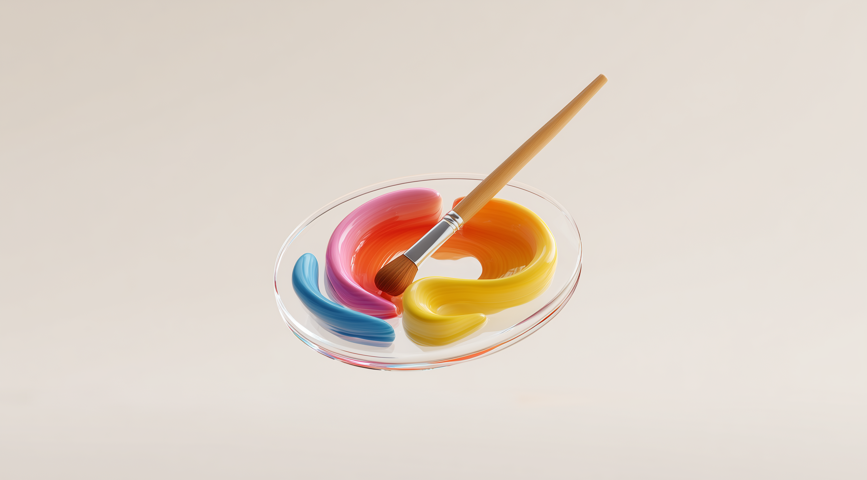
To start off, let’s talk about the building blocks of color: primary, secondary and tertiary colors. Primary colors red, blue and yellow are unique because they can’t be created by mixing other colors. They serve as the foundation for all other colors. When you mix two primary colors together, you get secondary colors. For instance, red and blue make purple, blue and yellow create green and yellow mixed with red results in orange.
When you mix a primary color with a secondary color, you create tertiary colors. These are the shades you get by blending colors like red and orange or blue and green. Grasping these relationships is important because it allows you to develop a cohesive color palette that feels deliberate and well thought out. It’s similar to learning the basic chords before you can strum your favorite song on the guitar.
Learn Hue, Saturation, and Value to Refine Your Color Choices
Next up are three essential attributes of color: hue, saturation, and value. Hue refers to the basic color itself. Think of it as the name of the color on the spectrum, like red or blue. Saturation deals with the intensity or purity of that color. Imagine a vibrant red versus a more muted or grayish red; the former is highly saturated, while the latter is less so. This distinction can drastically change the mood of your design.
Value refers to how light or dark a color appears. It’s all about contrast, which is essential for creating depth and visual interest in your work. By adjusting these three properties—hue, saturation, and value—you can fine-tune your color selections, ensuring that your designs not only look appealing but also express the right emotions and messages. Think of it as having a complete set of tools at your fingertips, enabling you to create visuals that genuinely connect with your audience.
Apply Color Harmonies to Create Visually Appealing Designs
In graphic design, crafting eye-catching visuals goes beyond just choosing colors that look good together; it involves understanding how those colors interact and connect with the audience. This is where the concept of color combinations becomes important. By using specific combinations, you can stir emotions, add depth and lead the viewer's gaze through your design. Each combination brings its own distinct qualities and mastering their use can transform your work from ordinary to truly captivating.
Color harmonies can be thought of as the rules of engagement between colors. They help determine which colors look great together and how they can best convey the intended message of your design. Whether you’re crafting a logo, a website or an advertisement, understanding these relationships will make a significant difference in how your work is perceived. Let’s delve into three foundational types of color schemes that can make your designs pop: monochromatic, analogous and complementary.
Create Monochromatic Analogous and Complementary Color Schemes
Monochromatic color schemes are all about variations of a single hue. This means you’ll take one color and explore its different shades, tints, and tones. The beauty of a monochromatic palette lies in its simplicity and elegance. It creates a cohesive look that’s easy on the eyes, making it perfect for designs where you want a subtle and sophisticated vibe, like a minimalist website or a sleek branding project. The key here is to play with saturation and value to add depth without overwhelming the viewer.
Analogous color schemes consist of colors that are next to each other on the color wheel. Think of a sunset with warm yellows, oranges, and reds. This blend creates a soothing and welcoming vibe, often associated with nature and balance. It's a great choice for designs aimed at evoking feelings of peace and tranquility. In contrast, complementary color schemes feature colors that sit directly across from one another, like blue and orange. This striking contrast generates a vibrant and energetic feel, making it ideal for designs that need to grab attention, such as marketing materials or advertisements.
Experiment with Split Complementary Triadic and Tetradic Schemes
If you’re looking to take your color game to the next level, split complementary, triadic and tetradic schemes offer exciting possibilities. Split complementary schemes involve using one base color and two colors adjacent to its complementary color. This approach maintains the bold contrast of complementary colors while softening the intensity, allowing for a more nuanced design. It’s a fantastic way to create visual interest without overwhelming the viewer.
Triadic color schemes take things up a notch by using three colors that are evenly spaced around the color wheel. This setup creates a vibrant palette that feels energetic yet still balanced. It’s like a party where each color brings its own unique vibe, but they all get along beautifully. Tetradic schemes, also known as double complementary schemes, involve two pairs of complementary colors. While this can lead to a rich and intricate palette, it’s important to be careful, too many colors can create a sense of chaos. Picking a dominant color can really help keep everything balanced and clear in your design.
Experimenting with different color harmonies can really boost the visual appeal of your designs while also helping you tap into specific feelings and reactions from your audience. Every choice you make has the power to tell a story, making your work more engaging and impactful. Try mixing these schemes in your next project and discover how color harmonies can truly transform your designs!
Explore the Psychological Impact of Colors in Branding and Design
Colors do more than just catch our eye; they hold significant emotional weight and can greatly shape how people view a brand or design. For anyone working in graphic design or branding, understanding the psychological effects of colors is important. We often link colors to certain feelings or ideas and this connection can be used to forge meaningful relationships with the audience. For example, a bright red can stir up feelings of passion and urgency, while a calming blue can inspire trust and tranquility. Recognizing how colors and emotions intertwine is key to creating impactful designs that resonate with viewers and encourage engagement.
When you're designing, it goes beyond simply choosing colors that look nice together. It's essential to grasp the feelings those colors evoke. Take bright yellow, for instance. It exudes happiness and optimism, making it a favorite among brands that want to project a friendly vibe. In contrast, darker colors like black often convey sophistication and elegance, which is why they're commonly used in luxury branding. By leveraging these color associations, designers can craft visuals that not only catch the eye but also resonate emotionally with their audience.
Use Color to Convey Emotions and Influence Audience Perception
Using color strategically allows designers to tap into emotions that can influence decision-making. For instance, the color green is often linked to growth and success, making it a favorite in branding for health and wellness products. If a company wants to project an image of vitality and freshness, green is usually a go-to choice. Similarly, purple can evoke feelings of creativity and luxury, making it ideal for brands in the beauty and fashion industries.
Think about how you feel when you land on a website with a bold red call to action. That color isn’t just chosen for aesthetics; it's intended to create urgency and encourage action. By deliberately selecting colors that align with the emotions you want to evoke, you can guide your audience's perceptions and responses. This kind of conscious color usage can lead to stronger brand loyalty and more effective communication.
Consider Cultural and Accessibility Factors When Choosing Colors
Cultural context plays a huge role in how colors are perceived. For example, while white symbolizes purity and peace in many Western cultures, in some Eastern cultures, it’s associated with mourning. This cultural significance can’t be overlooked in global branding efforts. Before settling on a color palette, it’s vital to consider the cultural meanings associated with your color choices to avoid unintentional miscommunication.
Accessibility is an important factor to consider. About 8% of men and less than 1% of women experience some form of color blindness, which affects how they perceive colors. As a designer, it's essential to ensure that your color choices are accessible. This doesn’t mean you have to avoid bright colors; it’s more about creating contrast and clarity so that everyone can appreciate your design. Utilizing tools that mimic how individuals with color blindness view your work can be incredibly useful in ensuring your designs are inclusive. By taking these aspects into account, you can craft designs that are not only visually striking but also connect on a deeper, more meaningful level.
Master Practical Color Models and Tools for Effective Design
Getting into graphic design involves becoming familiar with color models, which play an important role in choosing how colors will appear in different formats, whether on screens or in print. By learning about RGB and CMYK, you'll be able to create designs that not only look great but also function well in their intended mediums. Let’s explore these models a bit more.
Differentiate RGB and CMYK Color Models for Digital and Print
The RGB color model, which stands for red, green and blue, is mainly used for anything involving light, such as digital screens. It operates on an additive principle, meaning that when you combine these colors, they produce white light. When you mix equal amounts of red, green and blue, you’ll see that bright, vibrant white. If you’re designing for websites, apps or any other digital platform, you'll be utilizing RGB. This model offers a wide range of colors, making it ideal for creating striking visuals that stand out on screens.
On the flip side, there's the CMYK model, which stands for cyan, magenta, yellow and key (black). This model is subtractive, which means it starts with white and subtracts colors to create various hues. CMYK is the go-to for print media because it aligns with how printers mix inks. When designing something that will eventually be printed, it's critical to keep this model in mind. This ensures that what you see on your screen will closely match what appears on the final printed piece. The challenge here is that colors can look different when printed, so it's always wise to convert your RGB designs to CMYK before hitting that print button.
Use Color Wheels and Digital Tools to Generate Harmonious Palettes
Color wheels are fantastic tools for designers. They visually represent the relationships between colors, making it easier to select harmonious palettes. Using a color wheel, you can quickly identify complementary colors, those that sit opposite each other on the wheel, and create striking contrasts. This can be incredibly useful for creating impactful designs that grab attention.
But don't stop there; digital tools have taken color selection to the next level. Many design software programs offer built-in palettes and color pickers that help you experiment with various combinations. Tools like Canva provide features to generate color schemes based on your chosen hue, allowing you to see how different colors work together in real-time. This way, you can play around with shades, tints and tones until you find the perfect match for your project. Engaging with these tools not only enhances your design process but also boosts your confidence in your color choices. So whether you're a beginner or a seasoned pro, these resources can help you refine your skills and create visually stunning works.
Implement Advanced Techniques to Elevate Your Color Usage
When it comes to graphic design, really getting a handle on color theory goes beyond just the basics; it's about enhancing your skills to make your work stand out. Using advanced techniques can transform your designs into something visually stunning and emotionally resonant. One important aspect to concentrate on is color temperature, as it significantly affects how people perceive your designs. Grasping the way warm and cool colors interact can truly elevate your creations.
Warm colors like reds, oranges, and yellows can evoke feelings of energy, excitement, and passion. On the flip side, cool colors such as blues, greens, and purples tend to bring about a sense of calm, tranquility, and trust. By balancing these temperatures, you can not only enhance the mood of your design but also draw attention to specific elements. For example, using a warm color for a call-to-action button can make it pop against a cool background, enticing users to engage. It’s all about finding that perfect equilibrium that captures the right emotions and guides the viewer’s journey through your design.
Balance Color Temperature to Enhance Mood and Visual Interest
Balancing color temperature isn’t just about making random choices; it takes careful thought. You can think of it like mixing flavors in a recipe. If you add too much of one ingredient, it can dominate the dish, while a well-balanced mix brings everything together nicely. In design, you can create this effect by intentionally placing warm and cool colors next to each other, resulting in a contrast that is visually striking and emotionally engaging.
Imagine designing a website for a wellness brand. Using soft greens and calming blues as the primary colors sets a serene tone, while a splash of warm orange in the call-to-action buttons can energize users, encouraging them to take the next step. This kind of strategic color temperature balancing not only enhances the visual interest but also aligns the emotional responses with your brand’s message.
Fine Tune Color Hue Value and Saturation for Optimal Impact
Diving deeper into the nuances of color, let’s talk about hue, value and saturation. These elements are like the secret ingredients that can elevate your designs from good to great. Hue refers to the actual color itself, but when you start tweaking value and saturation, that's where the magic happens. Value is all about how light or dark a color is, which can dramatically affect the mood of your design. A darker shade can convey sophistication and seriousness, while lighter tones might suggest playfulness and lightheartedness.
Saturation relates to the intensity of color. A color that is highly saturated bursts with vibrancy and grabs attention, while a desaturated color tends to be more muted and subtle. By adjusting these elements, you can add depth and dimension to your designs. For example, when creating a brand identity, opting for a bold, highly saturated hue can make a strong impression. In contrast, using softer, desaturated shades of the same color can create a supportive background that enhances the main message without stealing the spotlight.
When you’re working on your designs, it’s important to experiment with these elements. Tweak the values and saturations until you discover that perfect balance that resonates with your audience and conveys your design’s purpose. The right combinations can create a visual experience that not only grabs attention but also leaves a lasting impression.
Conclusion
Understanding color theory is essential for anyone working in graphic design, whether you're new to the field or have been around for a while.
When designers grasp the basics of color relationships and the emotional effects colors can have, they can craft work that is both visually appealing and emotionally impactful.
Utilizing various color schemes and models, along with advanced techniques, allows for nuanced designs that effectively communicate a brand's message.
A careful consideration of color can greatly improve the overall effect of your graphics, making your designs both visually appealing and meaningful.
Embrace these principles to elevate your design practice and connect more deeply with your audience.